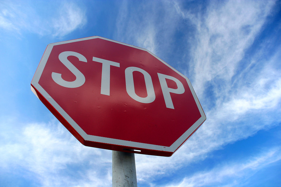
The stop sign is one of the most iconic and important signs in America, where most of the nation is designed with the automobile in mind. Road signs of all types, be they Yield, Railroad Crossing, or Do Not Pass, make up perhaps the largest portion of the signage and display industry, and the king of them all is the stop sign.
When you think about it, the stop sign is quite an odd looking display. It’s bright red, shaped like an octagon, and emblazoned with large, white letters. So how did such a unique sign come to be one of the most easily identifiable signs in existence? Well to get to the bottom of that question, we’ll have to start at the beginning.
The First Stop Signs
It may surprise you to learn that the earliest stop signs didn’t have much in common with the stop signs of today. The first stop signs were shaped like a square, measured 2 feet by 2 feet, and featured black lettering on a white background.
Stop signs were first installed in Detroit, Michigan (which makes sense, given the city’s vehicular heritage) in 1915, a full six years after Ford produced their first affordable, mass-produced automobile: the Model T. Interestingly, the first stop sign was installed one year after the first electric stoplight was installed in 1914.
The Modern Stop Sign Begins to Take Shape
In 1932, the quickly increasing use of automobiles and traffic signs led to the creation of a committee formed by members of two automotive safety regulation groups, the American Association of State Highway and Transportation Officials (AAHSO) and the National Conference of Street and Highway Safety (NCSHS).
In 1935, this new committee, now known as the Joint Committee on Uniform Traffic Control Devices, published the first “Manual on Uniform Traffic Control Devices for Streets and Highways” (MUTCD) in 1935, which implemented the octagon shape as an official regulation.
According to Reader’s Digest, the unique shape was chosen because it could more easily be recognized from the back and was more easily recognizable at night, resulting in less confusion at intersections.
As time went on and newer editions of the MUTCD were published new regulations, including a bright yellow background with red or black lettering, a size regulation of 24 inches by 24 inches, the implementation of “cat-eye” reflectors across the lettering and reverse side of the sign, and varying regulation heights ranging from 2.5 feet to 5 feet above the crown of the roadway.
Continued Stop Sign Evolution and New Regulations
By 1954, the stop sign’s authority was well established, though a few more changes were implemented. It was in this year that the stop sign was first given its bright red color, a change that was made in order to keep consistent with stoplights, which had been red since their first installation. Additionally, the 1954 edition of the MUTCD called for reflective white lettering and borders.
In 1966, stop signs were given federal funding contingent on their adherence to MUTCD regulations, which included raising the height of stop signs to six and seven feet in urban areas and increased emphasis of regular stop sign maintenance and repair.
Today, the most up-to-date edition of the MUTCD states that stop signs must measure 30 inches by 30 inches and must be mounted 7 feet above the ground in urban areas and five feet in rural areas. Stop signs must also be retroreflective, meaning the surface of a stop sign will reflect the light from a vehicle’s headlamps back to the driver, ensuring the sign will stand out.
Stop signs have come a long way in the last 100 years, and today, MUTCD regulations serve as guidelines for stop signs even in foreign countries. No matter where these signs are located, their message is perfectly clear — STOP!


