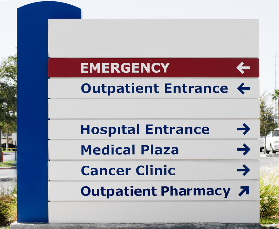
Hospitals see a lot of business. Unfortunately, there isn’t a day that goes by where someone isn’t in need of emergency healthcare or a visit with a doctor. Due to the sheer number of people that see the inside of a hospital during their lives, it’s important to make sure that a hospital is properly labeled at every turn. This prevents confusion and chaos when things start picking up and doctors and patients alike are in a rush.
For that reason, you need to ensure that your hospital is equipped with clear, vibrant, and healthy signage. Follow this brief checklist to double check that your hospital is outfitted with the best displays possible.
Are My Signs Fully Informative?
The primary function of any sign is to provide your patrons with the information they need to know, and to do so quickly, accurately, and concisely. In a hospital, this is especially important, as medical facilities tend to create a maze-like feeling as a result of their sterile, blasé environment.
The last thing patients, nurses, or doctors need in an emergency situation is trouble finding their way. In a medical setting, this could literally mean life or death. In order to be certain that your hospital signage is fully informative, you should make sure that each medical department is fully written out with clear signals pointing to the direction you should be going.
Additionally, your signs should make it clear when the wayfinder has arrived at their intended destination. This way, you can be sure your patients and staff don’t blow right past the correct area when they’re in a hurry.
Are My Signs Vibrant and Noticeable?
If you want your staff and patients to stay on the right path, you need to be certain that your signage catches the eye and stand out as important.
All of your safety, prohibitory, and directional signs should be printed in bright, easily-noticeable colors, as doing so will drastically reduce the risk of patients and staff getting lost, missing key information, or wandering into areas they do not belong. Furthermore, signs that stand out will reduce the time it takes for people to navigate accurately. This can really come in handy in an emergency situation.
Your choice of sign coloring can also have secondary effects that are equally important in a medical setting. For example, emergency care signs should be colored bright red to indicate urgency, while more long-term care departments, like pediatrics or oncology, should be printed in a cool blue as a way to instill a relaxing effect while still standing out from white, gray, or beige backgrounds.
Are My Signs Part of a Cohesive Unit?
One of the most important factors in hospital signage is to ensure that your many displays can be recognized as part of one cohesive unit.
If your signs are basically a hodge-podge of various imagery and colors, it can be extremely difficult for patients to notice signs bearing important information such as which department they’re in, where the nearest exit is, and what is or isn’t permitted on the unit. For hospital staff, hectic display layouts can cause many similar problems with the added disadvantage of on-the-job frustration.
To prevent these problems, each sign is your hospital should utilize the same color scheme and fonts. They should also be similar shapes, with the exception of EXIT signs. Signs can vary in size, but always make sure key information is displayed on a larger scale to be certain that everyone involved is properly educated and on the same page.
Are My Signs Written in Different Languages?
Hospitals see a lot of foot traffic from a number of different communities. America is a melting pot composed of a number of different ethnicities, and they all are in need of quality healthcare at some point. For this reason, you need to be certain that your signs are printed in different languages.
As with any other business or facility, the diversity of your audience must be considered. Be sure to do some research into the different demographic groups that make up your community. Then, make sure your signs cater to these groups.
Neglecting to properly translate directions written on your hospital displays will only lead to problems with navigation and further confusion, so be sure you’re covering all your bases.
Are There Enough Signs?
It might seem obvious, but in any setting, especially a hospital, you need to be certain that you have equipped your space with enough displays to minimize directional and informational challenges as much as possible.
If your space is adorned too sparsely, you’ll find that your staff and patients will have a much harder time finding their way. Make sure that your directional signs are evenly placed along each hallway and at every intersection. This way, once your patients or staff find the correct path, they’ll have an easier time staying on it.
On the other hand however, you also want to be sure that you don’t over-do it, as too many signs can create chaos and confusion just the same.
If you suspect that your hospital signage is in need of rehabilitation, don’t hesitate to contact the display experts at Bartush today. Whatever your job, Bartush can handle it!


