There are so many things to take into consideration when designing a new sign for your business, but a select few stand out amid all the factors that go into a successful sign.
So what are the most important aspects to look at during the design phase of your new sign? The answer boils down to five focus areas: color, contrast, letters, simplicity and size. These five components will guide the design of your sign and determine whether it is successful in its mission or not.
Color
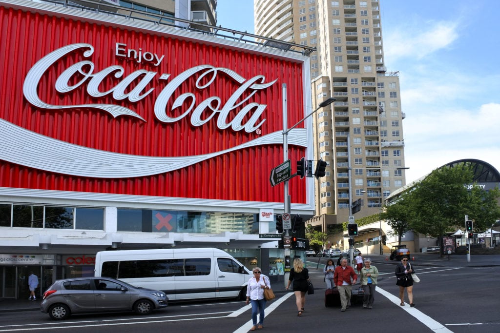
Think of some of the most recognizable signs you can. What comes to mind? McDonald’s? Starbucks? Coca-Cola? One thing every recognizable and memorable sign implements is color. Next to a Big Mac, when people think of McDonald’s, they think of red and yellow. The first color that comes to mind with Coca-Cola is red. Using your branding assets — especially color — in your sign is crucial in your efforts to further develop your brand and make your signage recognizable to the public.
Contrast
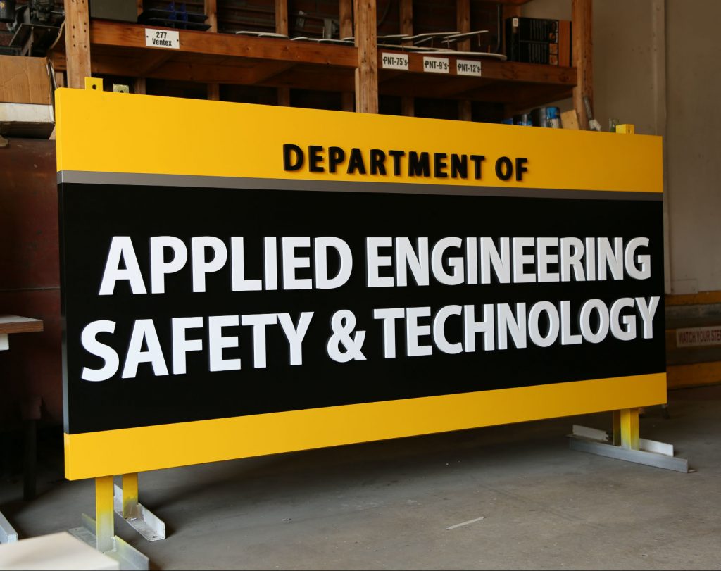
Your sign should also implement contrast to make it readable to the public. The concept here is pretty easy. If the color of the sign’s background and letters are too similar, it will be hard to read. To avoid this, make sure there is a significant amount of contrast between any type and the background of the sign so passerby can read your message. Even with the right amount of contrast, it’s important that the colors chosen don’t clash. Clashing colors can hurt readability and strain the eyes of a reader, so be sure that you have the right level of contrast with colors that complement each other.
Letters
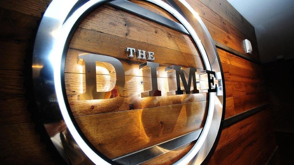
Choosing the right font for a sign is pivotal to its success, as fonts can make or break the effectiveness of a sign. Readability comes into play here as well. If the fonts aren’t readable, people will be unable to discern the messaging of your sign, which is the whole purpose of your sign to begin with. Larger signs typically make use of sans serif fonts, which are easier to read at larger sizes. Some signs utilize channel letters for their messaging, which are letters that are 3-D and provide texture for enhanced readability.

Simplicity
In most cases, your sign design should stay simple. Keep words a minimum and avoid using excessive amounts colors and images. Obviously, there are exceptions to this rule, but simplicity is appreciated by customers who have only a few seconds to take in what your sign has to offer. In many cases, simple designs work best, as they don’t overwhelm the viewer with extensive amounts of color or information.
Size
Many of the rules on this list relate to readability, and for good reason. Size is no different since it is directly linked to a viewer’s ability to read your sign. Signs that are smaller require smaller text, making it more challenging to read. On the other side, signs that are large with large text are much easier to read. In addition, large signs are more memorable. People remember large, unique signs and associate them with a particular place, business or product. Simply put, bigger is better.
Sign design can be difficult, but at Bartush Signs, we take great pride in collaborating with each of our clients to address their individual needs. We’ll help you through every phase of the sign design process, ranging from securing permits and designing the sign, to custom building it and installing it at your place of business. No matter what you need, Bartush Signs is here to make your sign design experience as effortless as possible.


