In designing anything that includes words and phrases, the font used determines whether or not your project will be effective. This is true for newsletters, posters, emails and signage. With the main goal of signage being to attract attention and get your message across, the chosen font is essential to the efficacy the sign.
If your business is looking for a custom sign solution, there are three major things you should keep in mind when brainstorming ideas. For your convenience, we’ve provided them below so you can make your sign as effective as possible.

Does It Match Your Message?
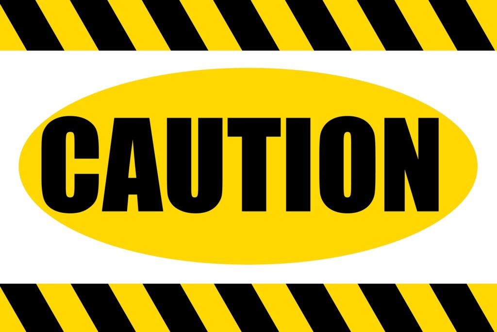
Certain fonts don’t fit with the message you may be trying to get across. For example, if you’re looking to install signs that stress safety and attention in the workplace, you shouldn’t use light, cursive fonts, as they won’t attract attention and get the important notices across. On the contrary, if you own a boutique, whimsical cursive fonts may fit your message, as they portray a sense of style better than strong, bold fonts ever would.
Matching the fonts used in your sign to your message is a critical step to drawing in customers, one that you should always consider when designing creative assets for your business.
Is It Readable?
Various factors determine whether your words are readable or not, including color, spacing and font type. When choosing color, it will be evident right away whether the phrases on the sign will be readable or not, and the sign manufacturer will be able to help you choose options that will make your sign more readable. When it comes to spacing, there are three different types of spacing to keep in mind when designing a sign, those being tracking, kerning and leading.
Tracking is the spacing between the characters (letters) in each word, sentence or paragraph. If the tracking is too tight, the characters may appear too jumbled together to be read effectively, while tracking that is too loose can make words too spread out for easy reading.
Kerning is the individual spacing between the two consecutive characters, which is used to adjust white space between characters that have too much or too little space between them.
Leading is the third spacing option to consider. It is the vertical spacing between lines of text that determines how spaced apart individual lines of text are.
All three of these spacing tools can be used to adjust wording in your sign to make it fit your goals and aesthetics, and it’s important to have a good understanding of them as your brainstorm a sign that will fit the needs of your business.

Serif or Sans Serif?
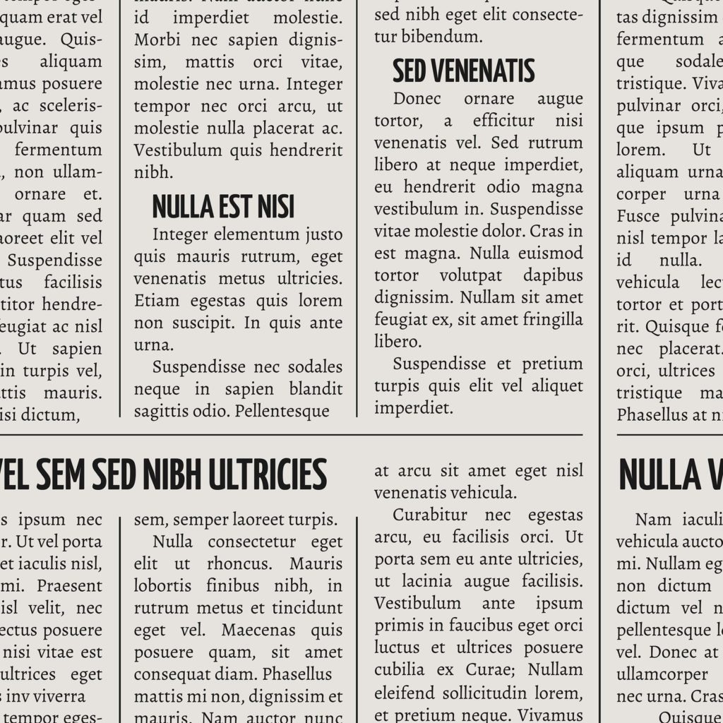
Serif fonts use little lines at the end of each character, with Times New Roman being the most prominent example. Serif fonts are more readable when the font sizes being used are small, which is why serif fonts are used in newspapers and magazines.
Sans serif, on the other hand, means “without line” and does not feature the lines, or serifs, at the end of each character. Sans serif fonts are more readable when text is larger, which may come in handy when designing your sign.
Whether you choose a serif font or sans serif font will be a decision that will have to be made as your consider fonts that are both attractive and readable to consumers. In addition to these two font types, remember to keep character spacing in mind throughout the sign design process, as well as whether your chosen font matches the message you want to get across. If you are unsure of any of these aspects, consult an experienced sign manufacturer for expert advice on what font choices will be best for your business.


