So, you’re shopping around for new signage for your business? Great! There is nothing more powerful than quality signage to promote your business. A quality sign will make your business standout, more memorable, and even a community staple. Some signs act as community landmarks, of course those are the cream of the crop when it comes to signage. You want your business’s name to be synonymous with neighbor.
“Wow, that sounds great! How do I get started?” We hear you saying. Well, it all starts making sure your sign is visible, readable, the proper size, in the right location, and uses all the right design elements.
A sign that hits all these marks is a sure-fire way to recognition and promotion that goes beyond the predictable.
Choosing The Right Location
You want to connect with your clientele and you certainly can’t so that from the bottom of a well. Of course that’s an exaggeration, but it makes a fair point: location, location, location. The location of your signage determines so much: sign height, design, visibility, lettering, contrast, readability, and distance. This means when you choose your signs location you have to factor in all of these variables.
Consider this, your sign is displayed near the closest highway. You’re trying to capture the attention of drivers, and this is no easy task. Drivers can’t look away for more than a couple seconds; so, that means the lettering has to be large enough to read from a distance, and you have to avoid heavy verbiage.
The opposite of this is true if the signage is located inside your space. You have more options here because customers can take time to read. This means you can have smaller lettering and a more information dense message.
Font Size
The general rule of thumb to keep in is for every inch of letter height add a zero for distance of best impact. For example, 3 inch tall letters are most effective at about 30 feet. Now, this doesn’t mean maximum readable distance; the maximum distance is just about 3 times that of the most effective distance.
So, when choosing your signs location you want to make sure it’s in a readable spot, the content is conscious of the space, and it’s relatively close to your establishment.
Color Scheme
Imagine this, you’re driving down the highway and an interesting billboard catches your eye. What does it look like? Is it yellow text on top of a white background? Probably not. That would be entirely unreadable. Does the text contrast the background making for a very visible, readable sign? More than likely yes.
There’s a reason for this. Think about it, you’re reading black text on a white background right now. Our eyes, and brains, need to be able to easily distinguish the characters from their background. This is important all the time, but when it comes to great signage it is paramount.
You don’t want your message blending into the background, so it’s important to choose bold, visible colors. Some of the most visible are black, red, and white. When you pair any of these colors with a contrasting background you’ve created a recipe for readability.
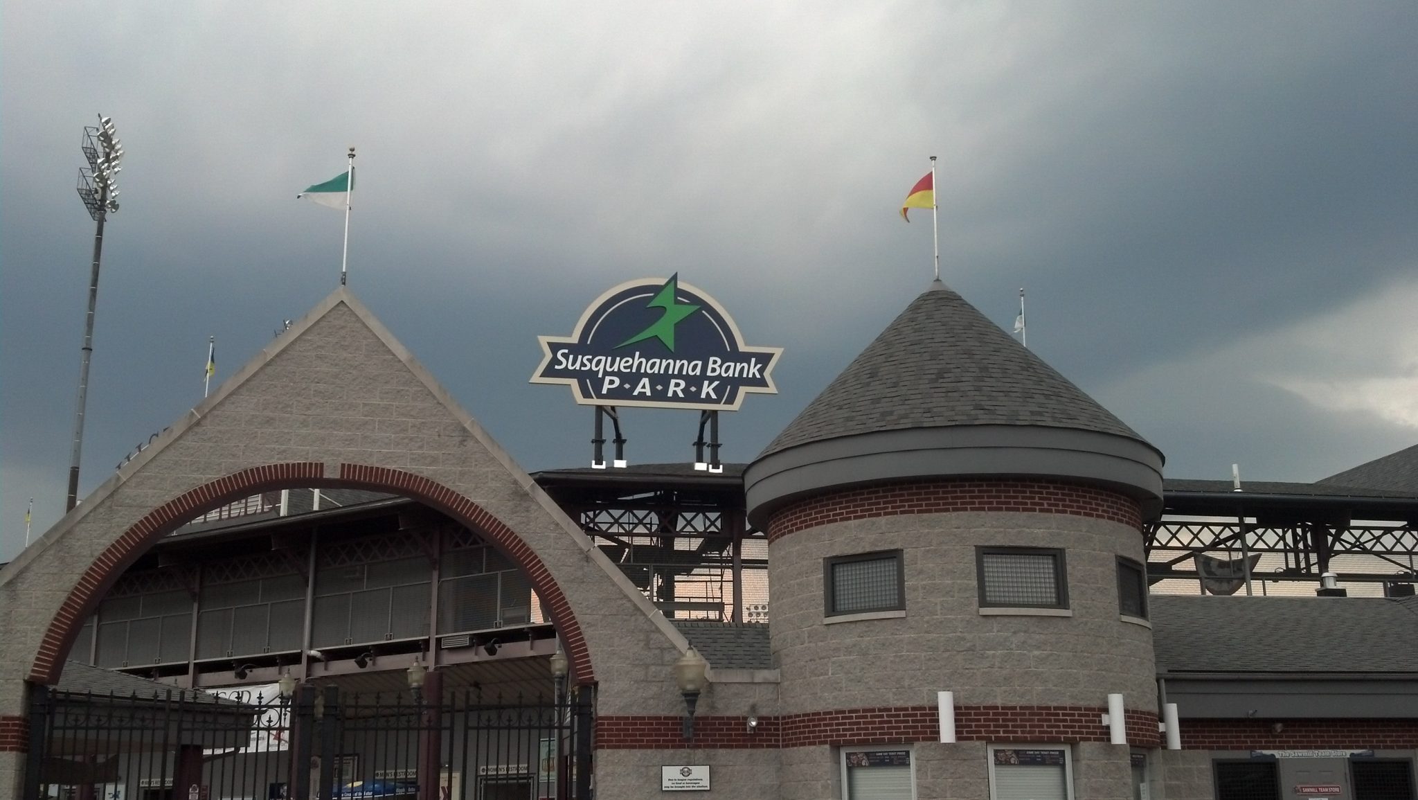
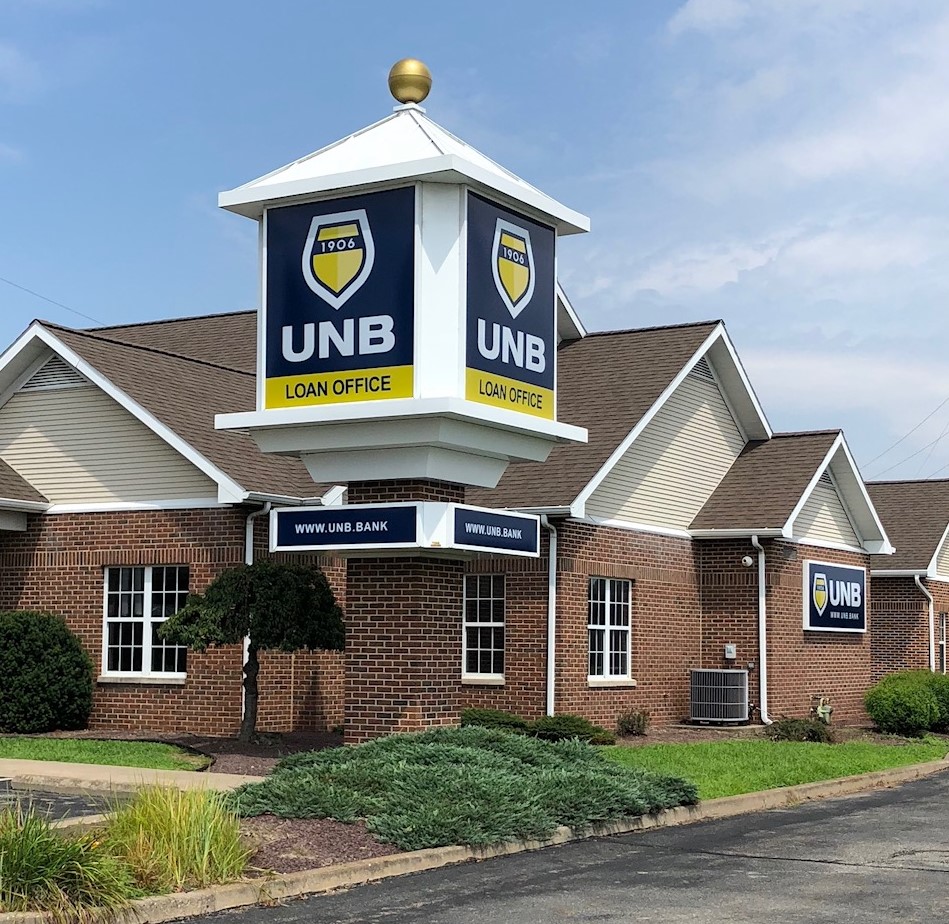
Here are some examples of Bartush made signs that follow this simple recipe:

As you can see here the Susquehanna Bank PARK sign is visible at great distances. This is of course due to its size, but it’s also thanks to its colors. Imagine this same sign with violet letters, it would be nearly impossible to read.

Here you can see UNB Loan Office taking advantage of some great contrasting colors. The yellow pops, but it doesn’t diminish the message. Everything here is clear, readable, and concise. It’s great signage.
Choosing the Right Team for the Job
The best thing you can do when thinking about creating effective signage is to choose the best team around. At Bartush Signs we know the importance of creating quality, visible, impactful signage. We’ve been doing this since 1946. For more information on how your signage can stand apart from the crowd check out our page about free standing signs, and contact us when you’re ready to get started!


