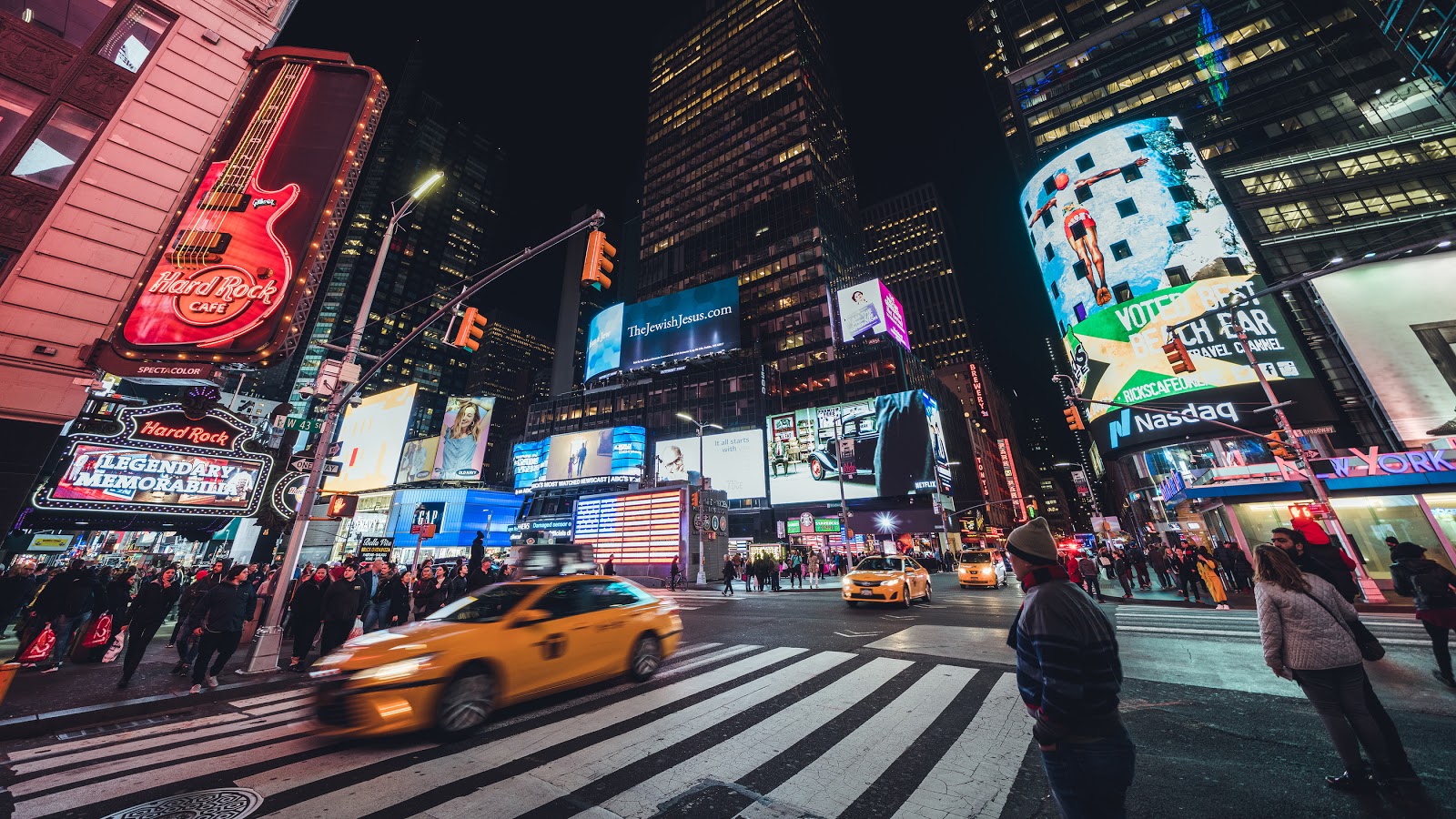
Big signs are everywhere. Whether it’s the billboards that line the highways or the large digital screens that advertise in cities, they all share the common goals — to get their messages across and attract more customers. But their goals can only be accomplished if the sign’s design is effective.
Keep these design tips in mind when creating artwork that’s larger than life.
Consider the Location
Before you even begin the process of drafting the design of your sign, you’ll have to first choose the location and this can prove to be the most important decision. If you opt for a billboard advertisement that will receive a lot of traffic, design the sign to contrast with the landscape behind it. But if you feel a sign on the side of a bus or truck would be the best choice for your brand, do not design it with a lot of text as it will be constantly moving and difficult to read. Instead, let the design speak for itself.
Digital LED signs also have many benefits. They are easily recognizable night or day, easy to maintain, and engaging and attractive. If you are unsure of what type of sign would be best for you to advertise your company with, call Bartush Signs. We are happy to discuss your options with you and help you select the one that would work the best for your company.
Ensure It’s Readable
If the message on your signage can’t easily be read and understood, the purpose of your sign is defeated. Make sure you choose a standard, easy-to-read font and follow the rule for every ten feet of viewing distance your sign will need one inch of letter height.
Just because it’s an oversized sign, does not mean you have to fill the sign with text. In fact, you should not do that. The “3 by 5” rule in the the industry suggests signs are best if they have three lines of text, up to five words each or five lines of text, up to three words each. Too much text can overwhelm passerbyers and deter them from reading the message.
Keep it Colorful, But Not Cluttered
What you lack in text should be made up in color and graphics. Bold colors and an eye-catching picture or graphic will work wonders in competing with other signs nearby and can be one of the most effective techniques to attract the attention of the passerbyers. But don’t give in to the temptation to fill in all of the white space. To ensure maximum readability and a clean-crisp look, leave thirty to forty perfect of the space empty. A cluttered and crowded sign will not do your business any favors.
When choosing the color scheme, it’s important to coordinate it with your brand’s logo and style, but also choose effective color combinations and contrast. The pairs that work the best together and are easily read from a distance are black on yellow, white on black, yellow on black, black on white, and blue on white.
Hire a Company You Trust
Designing a large sign can feel very overwhelming. With many different options to choose from and decisions to make, it’s easy to feel confused as to what would work best for your brand. At Bartush Signs, we walk you through the entire process from research, design, and installation. We will help you secure the necessary permits and perform any repair work down the road.
Hiring a signage company you truly trust will help take the stress off of your shoulders and that is one decision you can feel confident in making. Call Bartush Signs today to discuss your next sign project.


