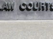
Creating a welcoming, accessible environment starts with your signage. ADA compliant signage is not only about regulations, it is about ensuring that every visitor feels included and able to navigate your space with ease. With thoughtful design, your signs can be both professional and accessible, reflecting your brand while supporting inclusivity.
Why ADA Compliant Signage Matters
The Americans with Disabilities Act (ADA) sets standards to ensure that individuals with visual, hearing and mobility impairments can independently access public and commercial spaces. For business owners, inclusive business signage not only demonstrates compliance but also shows that you value accessibility and equality. Well-designed ADA signage helps everyone, whether it is a client looking for the right office, or a customer navigating an unfamiliar building.
Use the Correct Fonts and Contrast
Readable typography is key. Choosing sans serif fonts like Helvetica or Arial are easier to distinguish visually. Avoid italic, decorative, or condensed typefaces because they hinder readability. Color contrast is another vital design element. Signs should have light characters on a dark background or dark colors on a light background with a minimum 70% contrast ratio. This helps those who are visually impaired read signage under various lighting conditions.
Include Raised Characters and Braille
For permanent room identification such as restrooms, exits, and conference rooms, signs should include raised lettering and Braille. The tactile characters should be between ⅝ and 2 inches tall and positioned to be easily reached and read by touch. Consistent placement is also important, placing signs 48 to 60 inches above the floor to ensure accessibility.
Ensure Proper Placement and Mounting
ADA regulations specify where signs should be located for optimal visibility and reach. For example, identification signs should be mounted on a wall, rather than a door. Directional or informational signs should be placed in visually prominent areas to help people navigate your space.
Maintain Professional Design and Brand Consistency
ADA compliance does not mean you have to sacrifice your brand aesthetic. Many businesses successfully integrate ADA compliant signage into cohesive designs that reflect their colors, materials, and style. Incorporating brand-approved color palettes, high-quality materials, and consistent typography allows your signage to look both professional and inclusive.
Inclusive design goes beyond compliance, it builds trust. When your inclusive business signage communicates accessibility and professionalism, it enhances the customer experience and strengthens your reputation. At Bartush Signs, we specialize in designing and installing ADA compliant signage that combines function, aesthetics, and full accessibility. Our team creates signage that is welcoming to everyone. Contact us today and let us bring your inclusive vision to life.